图像元素卡片
图像元素卡片是最灵活的卡片类型之一。
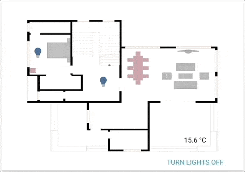 一个由图像元素驱动的功能性平面图。
该卡片允许您在基于坐标的图像上定位图标、文本甚至按钮。想象一下平面图,想象一下没有任何限制的 picture-glance!
要将 图像元素卡片 添加到您的用户界面:
- 在屏幕右上角,选择编辑
按钮。 - 如果这是您第一次编辑仪表板,将会出现 编辑仪表板 对话框。
- 通过编辑仪表板,您将接管此仪表板的控制。
- 这意味着当新的仪表板元素可用时,它将不再自动更新。
- 一旦您接管控制,就无法将此特定仪表板恢复为自动更新状态。但是,您可以创建一个新的默认仪表板。
- 要继续,请在对话框中选择三点菜单
,然后选择 接管控制。
- 如果这是您第一次编辑仪表板,将会出现 编辑仪表板 对话框。
- 添加卡片并自定义操作和功能 到您的仪表板。
YAML 配置
使用 YAML 模式时,或在 UI 的代码编辑器中更喜欢使用 YAML 时,可以使用以下 YAML 选项。
元素
元素是覆盖图像的活动组件(图标、徽章、按钮、文本等)。
可以向图像元素卡片添加几种不同类型的元素:
状态徽章
此元素创建一个表示实体状态的徽章。
Configuration Variables
状态图标
此元素使用图标表示实体状态。
Configuration Variables
状态标签
此元素通过文本表示实体的状态。
Configuration Variables
执行操作按钮
此实体创建一个可以用于执行操作的按钮(带任意文本)。
图标元素
此元素创建一个不与实体状态链接的静态图标。
Configuration Variables
图像元素
此元素创建一个覆盖背景图像的图像元素。
Configuration Variables
条件元素
与条件卡片类似,此元素将根据实体状态显示其子元素。
Configuration Variables
实体 ID 和匹配状态的列表。
当满足条件时显示的一个或多个 列出的类型 的元素。如下面的示例所示。
自定义元素
创建和引用自定义元素的过程与自定义卡片相同。有关更多信息,请参阅 开发者文档。
元素属性的注意事项
如何使用样式对象
使用 CSStransform: none 可以禁用此行为。
style:
  # 元素的位置
  left: 50%
  top: 50%
如何使用 state_image
根据实体的状态指定要显示的不同图像。
state_image:
  "on": /local/living_room_on.jpg
  "off": /local/living_room_off.jpg
如何使用 state_filter
指定不同的 CSS 过滤器
state_filter:
  "on": brightness(110%) saturate(1.2)
  "off": brightness(50%) hue-rotate(45deg)
如何使用点击和按住
如果指定了选项 hold_action,则在点击并按住实体半秒或更长时间后,将执行该操作。
tap_action:
  action: toggle
hold_action:
  action: perform-action
  perform_action: light.turn_on
  data:
    entity_id: light.bed_light
    brightness_pct: 100
示例
图标、标签和按钮示例
type: picture-elements
image: /local/floorplan.png
elements:
  - type: state-icon
    tap_action:
      action: toggle
    entity: light.ceiling_lights
    style:
      top: 47%
      left: 42%
  - type: state-icon
    tap_action:
      action: toggle
    entity: light.kitchen_lights
    style:
      top: 30%
      left: 15%
  - type: state-label
    entity: sensor.outside_temperature
    style:
      top: 82%
      left: 79%
  - type: state-label
    entity: climate.kitchen
    attribute: current_temperature
    suffix: "°C"
    style:
      top: 33%
      left: 15%
  - type: action-button
    title: 关闭灯光
    style:
      top: 95%
      left: 60%
    action: homeassistant.turn_off
    target:
      entity_id: group.all_lights
  - type: icon
    icon: mdi:home
    tap_action:
      action: navigate
      navigation_path: /lovelace/0
    style:
      top: 10%
      left: 10%
图像示例
type: picture-elements
image: /local/floorplan.png
elements:
  # state_image & state_filter - 点击切换
  - type: image
    entity: light.living_room
    tap_action:
      action: toggle
    image: /local/living_room.png
    state_image:
      "off": /local/living_room_off.png
    filter: saturate(.8)
    state_filter:
      "on": brightness(120%) saturate(1.2)
    style:
      top: 25%
      left: 75%
      width: 15%
  # 相机、红色边框、圆角矩形 - 点击时显示更多信息
  - type: image
    entity: camera.driveway_camera
    camera_image: camera.driveway_camera
    style:
      top: 5%
      left: 10%
      width: 10%
      border: 2px solid red
      border-radius: 10%
  # 单一图像、state_filter - 点击时执行操作
  - type: image
    entity: media_player.living_room
    tap_action:
      action: perform-action
      perform_action: media_player.media_play_pause
      target:
        entity_id: media_player.living_room
    image: /local/television.jpg
    filter: brightness(5%)
    state_filter:
      playing: brightness(100%)
    style:
      top: 40%
      left: 75%
      width: 5%
条件示例
type: picture-elements
image: /local/House.png
elements:
  # 当爸爸不在家且女儿在家时有条件地显示电视关闭按钮快捷方式
  - type: conditional
    conditions:
      - entity: sensor.presence_daughter
        state: "home"
      - entity: sensor.presence_dad
        state: "not_home"
    elements:
      - type: state-icon
        entity: switch.tv
        tap_action:
          action: toggle
        style:
          top: 47%
          left: 42%